The CTA gets lost below the fold on mobile
BlockingFixOpen
M
4 openMarketing Site
12 annotations
Should QA sit before Done in this flow?
SuggestionQuestionOpen
This toggle needs a clearer label
SuggestionChangeOpen
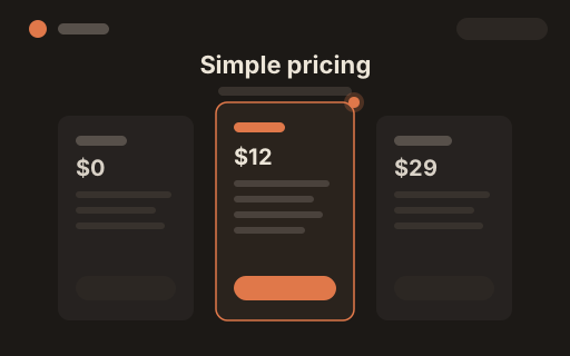
Annual billing as the default feels aggressive
ImportantChangeOpen
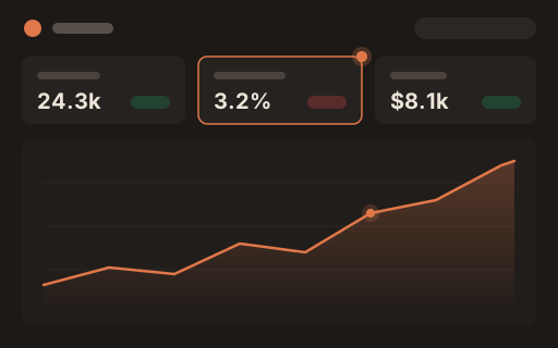
Chart colors fail contrast in dark mode
ImportantChangeOpen
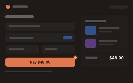
Error toast covers the pay button
BlockingFixOpen
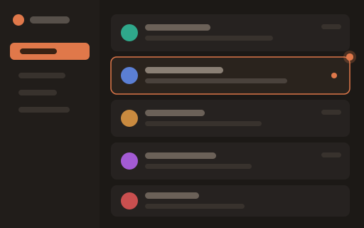
Unread indicator is too subtle at a glance
SuggestionChangeResolved
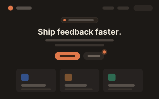
Hero headline could be ~20% shorter
SuggestionChangeOpen
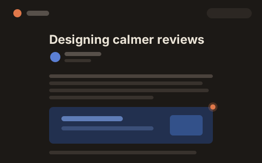
Byline avatar renders blurry on retina
ImportantFixOpen
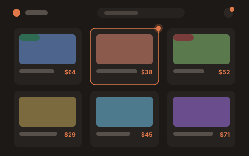
Out-of-stock badge missing on this tile
BlockingFixOpen
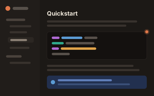
Code block overflows on small screens
ImportantFixResolved
Price column alignment drifts at tablet widths
ImportantFixResolved
Love the new hero — ship it once copy lands
SuggestionApproveResolved
D
2 openDesign System
7 annotations
Delete-account copy reads too casual
ImportantChangeOpen
Can we A/B the middle tier price?
SuggestionQuestionOpen
Tooltip clips at the viewport edge
ImportantFixResolved
Focus ring disappears on the dark theme
BlockingFixOpen
S
3 openSupport Inbox
8 annotations
Sidenote
Pin feedback to the exact element
Enter your email to sign in or sign up